
From Figma to Tailwind Without the Translation Step
Paste the CSS, attach a screenshot, and Cursor produces the component. The interface work I used to schedule days for now takes an afternoon, and what remains is everything a picture cannot express.
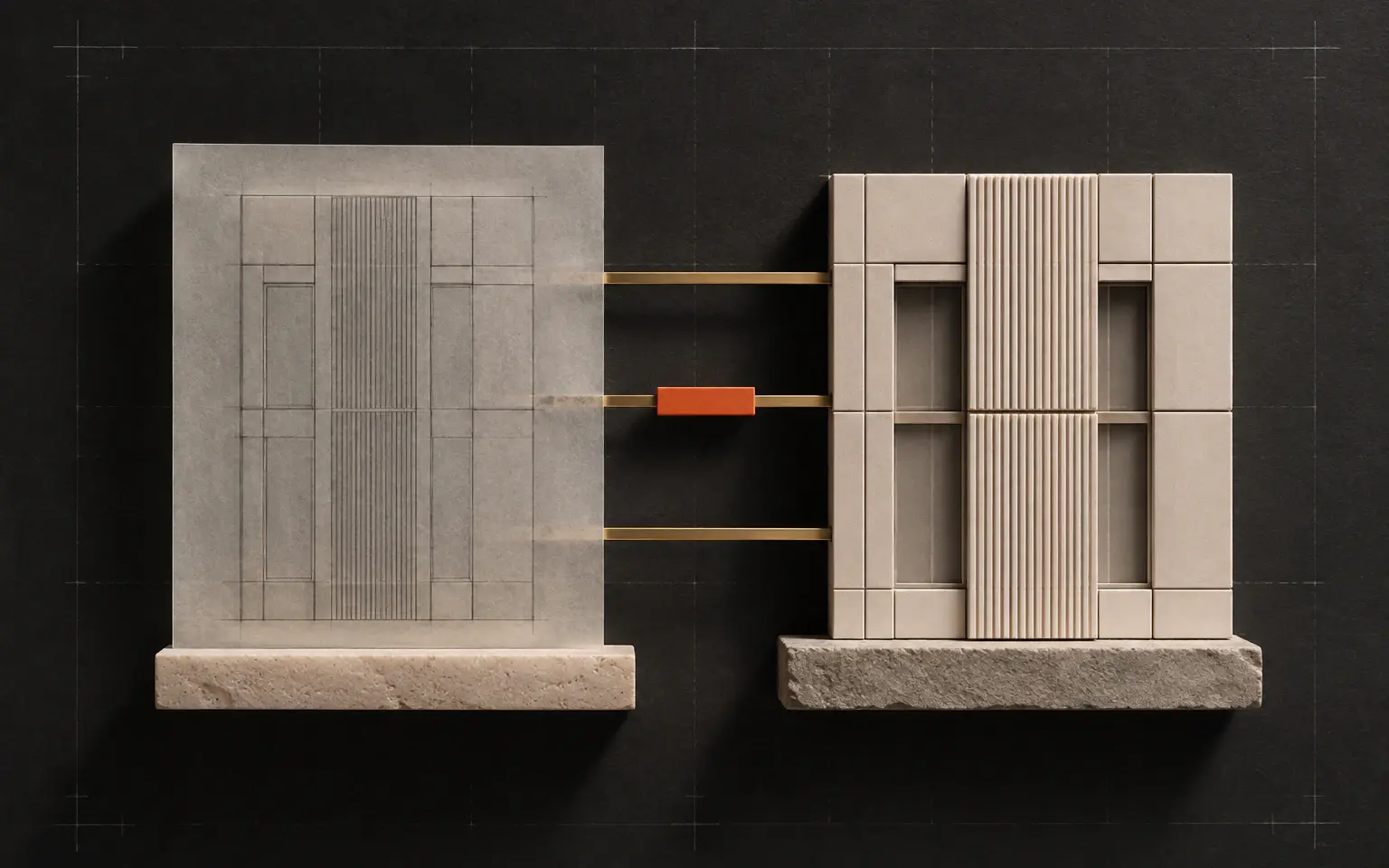
For most of my career, a meaningful share of frontend work has been translation. A designer produces a layout, and a developer reads it, measures it, and rebuilds it in a different medium. The value added in that step is small, and the effort is not.
That step has largely collapsed, and I do not think the industry has fully absorbed what it means yet.
The workflow
It is unremarkably simple, which is part of the point.
Select the component in Figma and copy the CSS that Dev Mode produces. Take a screenshot of the same component. Give both to Cursor with a short description of what it is and where it belongs. You get back a Tailwind implementation that is close enough to review rather than rewrite.
The screenshot and the CSS do different jobs, and you want both. The CSS carries exact values (spacing, color, radii, type sizes), while the image carries structure and intent, which is what tells the model that this cluster is a card, that these three items are one group, that this element is a label for that input. Either on its own produces something noticeably worse.
Responsive work follows the same pattern. Share the mobile frame alongside the desktop one, with its CSS, and the breakpoint behavior comes out largely correct. This surprised me more than the single-viewport case did.
Where the screenshot approach stops
Working this way for a while surfaces a specific limitation, and it is worth being precise about it because it explains what to do next.
A screenshot shows you a value. It cannot tell you where the value came from.
When a padding is 24px, the image cannot distinguish between "this is the space-6 token, used everywhere" and "someone nudged this one element and it happens to be 24px." Both look identical. So the generated code is pixel-accurate and system-blind: you get a wall of literal values where you wanted references to your design tokens.
On one component that is invisible. Across a full interface it is design-system drift, arriving faster than before because the code is being produced faster than before.
This is the failure mode I would warn people about most. The output looks right, which is exactly why it survives review.
The more structured route
Figma's Dev Mode MCP server, in beta since the summer, addresses this directly, and it is worth setting up if you are doing more than a handful of components.
Rather than pasting an image, you connect the design tool to the editor and the agent can request the selection's code, the image, and, the part that matters, the variable definitions. Because it can read the real variables, the generated code references your spacing and color tokens instead of guessing at their values. Tailwind and React are what it returns by default, which suits how most teams are already working.
It is still beta, it needed the desktop app until the hosted version arrived a couple of months ago, and I would not build a team's entire process around it yet. But the direction is clear, and it is a better direction than screenshots: the design tool stops being a picture to be copied and becomes a source of structured data to be queried.
I now use both. Screenshots for a quick one-off or when I only have an exported frame. The MCP route when I am building anything that has to stay consistent with a system.
What still needs a developer
If the translation step is gone, it is worth being honest about what is left, because that is where the job is going.
States that do not appear in the frame. A design usually shows the resting state. Hover, focus, disabled, loading, empty, error, and the long-text case are frequently absent, and no tool can infer them from a picture. In practice this is now the larger part of implementing a component.
Semantics and accessibility. Visual fidelity is not structural correctness. Whether something is a button or a div that looks like one, whether headings descend in order, whether an input is actually associated with its label: none of that is visible in a screenshot, and getting it wrong produces an interface that looks perfect and fails for a portion of its users.
System judgment. Deciding that two similar-looking components should be one component with a variant, rather than two implementations that will drift apart, remains a human call. Generated code is happy to give you the second.
The rules between breakpoints. Two frames give you two known states. What happens in between is inferred, and inference is usually reasonable and occasionally wrong in ways that only show up on a device nobody tested.
What it actually changes
I do not think this eliminates frontend work. I think it removes the part of frontend work that was least deserving of a senior engineer's time, and leaves the part that always deserved more of it.
The bottleneck moves. When implementation was expensive, it was rational for a designer to hand over a static frame and let the developer absorb the ambiguity. When implementation is cheap, the ambiguity becomes the expensive part, and the pressure shifts onto the design to be more complete: more states, more edge cases, clearer token usage.
That is a healthier place for the pressure to sit. It is also a real change to how the two roles work together, and I suspect the teams that adapt to it deliberately will get considerably more out of this than the teams that simply generate components faster.